SAT Scatterplots Cheat Sheet 2025
Test Preparation
Jun 30, 2025
Learn how to master graph interpretation on the SAT with strategies for analyzing box plots, bar graphs, and scatterplots effectively.

Mastering SAT Graph Interpretation in 3 Steps
SAT graph questions can feel tricky, but they’re an opportunity to score points if approached strategically. This guide focuses on three graph types you’ll encounter - box plots, bar graphs, and scatterplots - and a simple 3-step method: read, compare, infer. Here's the breakdown:
Box Plots: Summarize data with quartiles, medians, and outliers. Key for comparing distributions.
Bar Graphs: Compare categories using bar heights. Focus on labels, units, and trends.
Scatterplots: Analyze relationships between variables. Look for correlations and trends using the line of best fit.
Avoid common mistakes like misreading axes, ignoring units, or overlooking outliers. Practice is critical for building confidence and speed.
Quick Tip: Start by carefully reading graph titles, axes, and labels. Then compare data points for trends and relationships. Finally, infer conclusions by connecting observations to the question.
Strong graph skills don’t just boost your SAT score - they’re useful in college and beyond.
5 Strategies for Reading Tables and Graphs
Understanding the 3 Main Graph Types

The SAT includes three primary graph types designed to test your ability to interpret data effectively. Each type has distinct characteristics that are important to recognize quickly. Let’s explore what makes each graph unique and how the SAT uses them to challenge your analytical skills.
Box Plots
Box plots provide a visual summary of data using five key numbers: the minimum, Q1 (first quartile), median, Q3 (third quartile), and maximum. The central rectangle, known as the interquartile range (IQR), highlights the middle 50% of the data. A vertical line within the rectangle marks the median, splitting the data into two halves. Extending from the box, the "whiskers" reach out to the minimum and maximum values, excluding any outliers.
Outliers, which fall significantly outside the expected range, appear as individual dots beyond the whiskers. Each segment of the box plot represents roughly 25% of the data. If the median line is closer to Q1, the data skews to the right; if it’s closer to Q3, the data skews to the left. On the SAT, you’ll often need to compare multiple box plots side by side to analyze differences in medians, ranges, or outlier patterns. Now, let’s move on to bar graphs.
Bar Graphs
Bar graphs are perfect for comparing categories by using bars to represent numerical values. They make it easy to identify which categories have the highest or lowest values. Pay close attention to the graph’s axes, labels, and units (e.g., dollars, percentages, or thousands) to ensure accurate interpretation. Also, check that the baseline starts at zero to avoid misleading visuals.
The arrangement of the bars - whether alphabetical, by size, or chronological - can help you spot trends or patterns. SAT questions might ask you to find the largest or smallest values, calculate differences between categories, or determine what percentage one category contributes to the total. Next, let’s examine scatterplots and their role in analyzing variable relationships.
Scatterplots
Scatterplots are used to show relationships between two variables by plotting individual data points on an xy-plane. Each dot represents one observation, connecting two variables. You may observe patterns such as positive, negative, or no correlation.
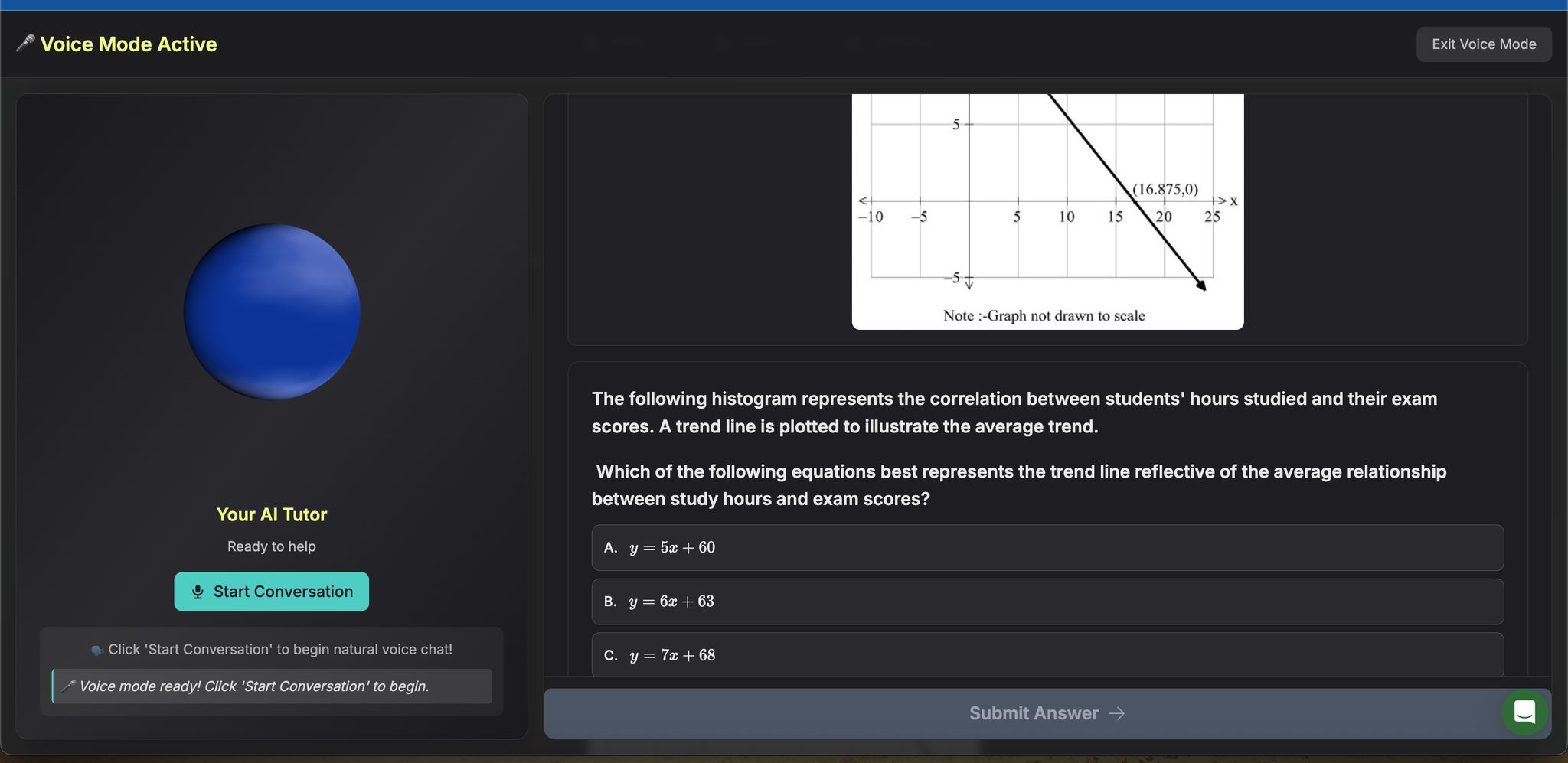
A line of best fit, or trend line, often accompanies scatterplots to indicate the overall direction of the data. For SAT questions, focus on the slope and y-intercept of this line. The slope reveals the rate of change - how much the y-variable changes for each unit increase in the x-variable - while the y-intercept indicates the expected y-value when x equals zero. It’s important to make predictions only within the range of the data provided. For instance, if a scatterplot shows study hours versus test scores with the equation y = 2x + 50, you could predict that 5 study hours would result in a test score of 60 (2 × 5 + 50 = 60).
Understanding these graph types is essential before applying the SAT’s "read, compare, infer" strategy.
The 3-Step Graph Reading Method
Understanding how to tackle SAT graph questions can feel overwhelming, but breaking it into a simple, three-step process can make all the difference. This method helps you analyze box plots, bar graphs, and scatterplots with ease, turning what might seem complex into something manageable. Since our brains are wired to process visuals faster than text or numbers, this approach takes full advantage of that natural ability, helping you work quickly and confidently under test conditions.
Step 1: Read
Start by carefully examining the graph's title - it will tell you the main focus of the data. Then, take a close look at the axes (x and y), the units (like feet, pounds, or percentages), and any legends or keys that explain symbols, colors, or line styles.
On the SAT, graphs often use U.S. standards, such as measurements in feet or pounds, dates formatted as MM/DD/YYYY, and commas as thousand separators. Pay attention to details like whether values are in thousands, millions, or percentages, as these will impact your calculations.
For scatterplots, check if there's an equation for the line of best fit. If you're analyzing box plots, identify the quartiles and any outliers. By taking the time to carefully observe these elements, you'll avoid common mistakes and set yourself up for success when interpreting the data.
Step 2: Compare
Once you've gathered the basics, move on to comparing data points to identify trends, differences, and relationships.
Bar Graphs: Compare the heights of the bars to see which categories have the highest or lowest values. Look for any large gaps that might highlight significant differences.
Box Plots: Focus on the medians, the size of the boxes (which represent the interquartile range), and any outliers. If one group's box is entirely higher or lower than another's, it could signal a meaningful difference in data distribution.
Scatterplots: Look at the overall direction of the points - are they trending upward (positive correlation), downward (negative correlation), or showing no clear pattern? Also, note any clusters of points or outliers that stand out from the general trend.
"Data visualization helps you understand a dataset's state and trend without effort. We evolved over millions of years to make quick decisions based on visual cues, and charts exploit this ultra fast brain-eye system so we can understand huge datasets with ease." - Ben Garvey
These comparisons will give you the insights needed to tackle the specific questions that follow.
Step 3: Infer
The final step is to connect what you've observed to the question being asked. This is where you draw conclusions based on the data patterns you've identified.
For scatterplots, you might need to predict future values using the slope of the trend line - but avoid making guesses far beyond the range of the data. With box plots, differences in medians, ranges, or outliers can reveal key insights about the populations being compared. For example, a higher median in one group suggests that group generally has higher values for the variable being measured.
Inference questions often require you to go beyond the surface. Instead of simply repeating what the graph says, look for answers that logically combine multiple pieces of information. The right answer will often synthesize details from the reading and comparing steps to form a solid conclusion.
Common Mistakes and How to Avoid Them
Even with the best preparation, SAT test-takers often lose points on graph interpretation questions due to avoidable errors. These missteps can be costly, but identifying common pitfalls and adopting a systematic approach can help you tackle these questions with confidence.
Misreading Axes or Labels
The first step in interpreting any graph is understanding its axes, labels, and scales. Rushing to analyze data without fully grasping what the graph measures is a common error.
Pay close attention to U.S. date formats, which are written as MM/DD/YYYY, unlike the DD/MM/YYYY format used in many other countries. Similarly, watch for number formatting - commas are used as thousand separators in the U.S., so a value like 1,500,000 might also appear as 1.5M or 1,500K.
Be wary of misleading scales, which can distort how data is perceived. For example, a bar chart with a y-axis starting at $95,000 instead of zero might exaggerate a $2,000 difference, making it look much larger than its actual 2% change. Always check if the y-axis begins at zero or a higher value before drawing conclusions.
Graphs without clear labels can also trip you up. If a chart seems confusing, double-check for legends or keys - they might be in the title or tucked away in a corner. Confirm the units being used and ensure you interpret them correctly before proceeding.
Ignoring Units and Conversions
Misinterpreting units is another frequent issue on the SAT. Always verify the units provided and perform any necessary conversions. Keep in mind that SAT graphs often use U.S. customary units, such as inches, feet, or Fahrenheit.
Temperature conversions, in particular, can be tricky. For instance, 0 degrees Celsius equals 32 degrees Fahrenheit, so a graph showing a temperature change from 30°F to 35°F represents a much smaller actual change than the same numeric range in Celsius.
When scientific notation appears, convert it into a more familiar format. The SAT often uses shorthand like "K" for thousands, "M" for millions, or "B" for billions. Understanding these conventions will make interpreting the data much easier.
Even when units are correctly interpreted, overlooking outliers or clusters in the data can still lead to mistakes.
Missing Outliers and Data Clusters
Outliers and clusters are key to understanding many SAT graph questions, yet they are often overlooked. An outlier is a data point that doesn’t fit the overall pattern, while clusters are groups of closely grouped points that follow a common trend.
When working with scatterplots, take a moment to visually scan for clusters and outliers. Clusters indicate patterns, while outliers often highlight exceptions or special circumstances that the question may ask about. For box plots, outliers appear as individual dots beyond the whiskers. These points aren’t just decorative - they represent real data that could be central to solving the problem.
The position of the median line within the box also provides valuable insight. A centered median suggests symmetry in the data, while a skewed median indicates asymmetry. While you won’t need to calculate the interquartile range (IQR) on the SAT, understanding that outliers fall outside 1.5 times the IQR above the third quartile or below the first quartile can help you recognize unusual data points.
Graph Types Comparison Chart
Understanding the differences between box plots, bar graphs, and scatterplots can help you quickly decide which approach to use for SAT questions. Each graph type has a unique purpose and shows up in different test scenarios.
Graph Type | What It Shows | Key Features | Common SAT Questions | How to Identify |
|---|---|---|---|---|
Box Plot | Data distribution with quartiles and outliers | Displays a five-number summary: minimum, Q1, median, Q3, maximum; outliers appear as dots beyond whiskers | Compare group distributions; find medians; identify outliers and data skewness | Rectangular box with whiskers extending outward; dots may appear beyond whiskers |
Bar Graph | Categorical data represented by bar heights | Bars show discrete categories; height reflects frequency or value | Compare category values; calculate totals or averages; analyze frequency | Vertical or horizontal bars with gaps between them; clear category labels |
Scatterplot | Relationship between two continuous variables | Points plotted on a coordinate grid; may include a trend line | Analyze correlations; predict values using a trend line; spot outliers | Dots scattered across a grid; patterns may show upward, downward, or no clear trend |
This chart works hand-in-hand with the three-step method ("read, compare, infer") by highlighting the key features of each graph type, making it easier to focus on the right details during analysis.
Box plots are perfect for summarizing data distributions. They highlight medians, quartiles, and outliers, giving you a clear view of how data is spread. For example, if the median is closer to Q1, the data is skewed to the right; if it's closer to Q3, it's skewed to the left. On the SAT, you might be asked to compare distributions between groups or determine which dataset has greater variability.
Bar graphs are all about comparing categories. Unlike histograms, which deal with ranges of continuous data, bar graphs focus on discrete categories, with gaps between the bars. SAT questions often require you to interpret these graphs to find specific values, calculate averages, or determine which category has the highest or lowest frequency.
Scatterplots are used to explore relationships between two variables. A positive correlation means the points slope upward, while a negative correlation slopes downward. If the points are scattered without a clear pattern, there's little to no correlation. On the SAT, scatterplot questions often include a line of best fit, asking you to predict values or compare actual and predicted data points.
Each graph type has a distinct role: box plots summarize data distributions, bar graphs compare categories, and scatterplots analyze relationships between variables. Use this chart to quickly identify the right graph for the type of analysis needed.
How ChatSAT Helps You Master Graph Reading

ChatSAT simplifies the challenge of interpreting graphs, turning it into a skill you can confidently rely on for the SAT. The platform zeroes in on the three graph types that dominate the test: box plots, bar graphs, and scatterplots. By focusing on these essentials, ChatSAT ensures you're ready for what actually counts on test day. This aligns perfectly with the "read, compare, infer" strategy discussed earlier.
The platform’s adaptive practice adjusts to your skill level, targeting areas where you need improvement. For instance, if you struggle with spotting outliers in box plots, ChatSAT provides tailored drills to sharpen that skill. On the flip side, if you're already comfortable identifying basic scatterplot correlations, the system challenges you with more advanced tasks, like analyzing trend lines or predicting data points.
What makes ChatSAT stand out is its real-time feedback. The moment you misinterpret an axis label or overlook an important data point, the system flags the mistake and explains the correct approach. This immediate correction helps you avoid bad habits while reinforcing the proper techniques, making the "read, compare, infer" method feel like second nature.
ChatSAT also offers performance tracking that goes beyond just marking answers right or wrong. It monitors your progress on specific skills, such as reading quartile values in box plots or calculating correlation strength in scatterplots. The detailed analytics let you see exactly where you’re excelling and which areas need more attention, giving you a clear roadmap for improvement.
"Our mission is simple – Help you raise your SAT score without the confusion of what to study next." – ChatSAT
The platform’s smart reviews are designed to tackle recurring mistakes. For example, if you repeatedly mix up positive and negative correlations in scatterplots, ChatSAT creates custom review sessions to help you master correlation patterns. It remembers these error trends and ensures you get enough practice to overcome them.
For students short on time, the Speedrun mode is a game-changer. This feature focuses exclusively on graph interpretation under timed conditions, helping you develop the quick decision-making skills needed for the SAT. With less than two minutes per graph question, regular practice in Speedrun mode builds the mental shortcuts that make analyzing graphs faster and more efficient.
ChatSAT also ensures that all practice aligns with U.S. standards, so the questions you tackle mirror actual SAT test conditions.
To kick things off, ChatSAT uses diagnostic assessments to create a personalized study plan. Starting with a coordinate geometry evaluation, the platform pinpoints your strengths and weaknesses in graph interpretation. From there, it crafts a tailored study path, focusing your energy on the areas that can deliver the biggest score improvements.
Conclusion: Graph Skills Lead to Higher SAT Scores
Getting the hang of graph interpretation isn’t just about making sense of data - it’s a way to level up your SAT score. The SAT’s Information and Ideas questions lean heavily on your ability to navigate box plots, bar graphs, and scatterplots. Students who confidently use the "read, compare, infer" method tend to outperform those who rely on guessing their way through.
Breaking down axes and labels, comparing data points, and drawing conclusions can turn even the most complex visuals into straightforward answers. This process of inferring ties your observations directly to the correct choice.
By sticking to this method and practicing regularly, you’ll build the kind of mental shortcuts that make test day less stressful and more successful. Repetition helps sharpen your ability to spot patterns and trends quickly. Adding timed practice into the mix mimics the actual test environment, helping you stay calm and confident when it counts.
But graph skills aren’t just about acing the SAT - they’re tools you’ll use long after test day. Whether you’re analyzing charts for a college project or making data-driven decisions in your career, the ability to pull insights from visual data is a skill that keeps paying off. Every minute you spend honing this ability now contributes to both a stronger SAT performance and a brighter academic future.
ChatSAT’s adaptive practice system takes this one step further. It focuses on the exact graph types featured on the SAT, offering real-time feedback and personalized study paths to reinforce the read, compare, infer approach. With the right tools and consistent effort, graph interpretation can go from being a challenge to one of your strongest assets. Start building these skills now, and you’ll not only boost your SAT score but also set yourself up for long-term success.
FAQs
How can I use the 'read, compare, infer' method to better interpret graphs on the SAT?
To get the most out of the 'read, compare, infer' strategy for interpreting SAT graphs, start by thoroughly reading the graph. Pay close attention to its structure - look at the axes, labels, and data points to grasp the basics. Then, compare the data presented. Identify any trends, differences, or relationships that connect to the question at hand. Finally, infer the main takeaway by combining the visual details with the question's context. Using this step-by-step approach can make graph analysis more manageable and improve your accuracy. Practicing this method regularly can boost both your confidence and your ability to tackle graph-related SAT questions effectively.
What are the most common mistakes students make when interpreting box plots, bar graphs, and scatterplots on the SAT, and how can they avoid them?
Students often stumble when interpreting box plots, bar graphs, and scatterplots on the SAT. This usually happens because they rush through the questions or misunderstand key features of the graphs. Some typical errors include misreading the scales, skipping over important labels, or failing to notice outliers. For instance, students might confuse quartiles and medians in box plots, assume the heights of bars in bar graphs represent totals without checking the scale, or miss critical details in scatterplots like clusters or trends.
To steer clear of these mistakes, it’s important to approach these graphs methodically. Start by carefully examining the graph, paying close attention to scales, labels, and any breaks. Next, compare the data points thoroughly, keeping an eye on units and relationships between them. Finally, draw conclusions cautiously, making sure to factor in outliers and avoid making sweeping generalizations. Taking a bit of extra time to follow these steps can make a big difference in interpreting data accurately and confidently.
Why is learning to interpret graphs important for success in college and your career?
Mastering the art of interpreting graphs isn't just about scoring higher on the SAT - it’s a skill that pays off in both academic and professional settings. In college, understanding graphs enables you to break down research data, make sense of scientific studies, and sharpen your critical thinking. These skills are crucial for thriving in areas like science, business, and social studies.
In the workplace, knowing how to read and analyze graphs helps you evaluate market trends, review financial reports, and monitor performance metrics. This ability not only supports smarter decision-making but also empowers you to present insights clearly, making you an indispensable part of any team.